 
here is a collection of fonts i have gathered to see which ones suited the title and theme
 Eventually i found a font called inversion which i like and feel as if it could be on a music magazine with its contemporary edge which reflects the music within my magazine.the font is a type of block serif and decorative hybrid.
Album covers i like

All these covers have something in common and that is that they are all odd and abstract, avant-garde to say if you will.
magazines i find inspirational/like the style of.    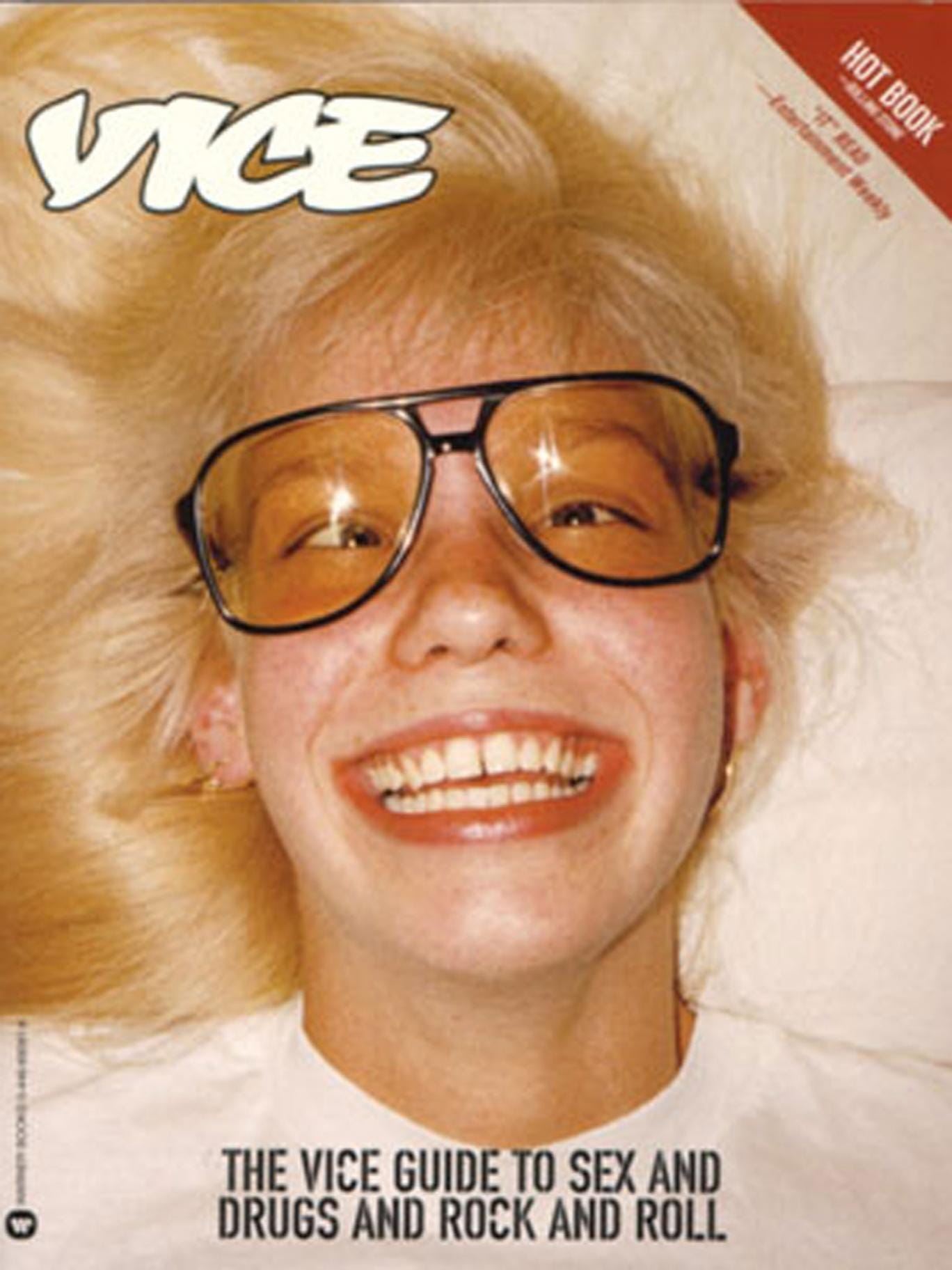   A theme through these magazine covers is minimalism and focus on the main image and masthead.the models hands are in most of the pictures touching the face/head is a common theme almost the thinking mans pose or covering part of the face.
Imagery i find
interesting are very LoFi,film style pictures because it gives the images muted soft tones reminiscent of the 90's rave scene with the snapshot aesthetic.
|
Thursday, 1 October 2015
Style/ iconography of my product
Subscribe to:
Post Comments (Atom)
No comments:
Post a Comment