Friday, 18 December 2015

Final front cover draft

These are all the shots i have taken.they were taken in a hallway with a white background with two sources of light the flash and the natural light.These images are not ideal and i am looking to take another batch in the studio for better quality .

Upper mid shot


Upper mid shot.model is smiling which takes away from the serious feel of the magazine.the shot was taken as a pair of headphones are caught in mid air.

Upper mid shot of face

Mid shot  of torso with flash and natural light.

Close up of face without glasses with headphones around neck.

Upper mid shot with direct light on face.

Upper mid , with model holding a prop 


Finished front cover

Finished contents page


I decided to use this image as it added an new element into my double page spread which is the drum machine while still using images from the same shoot to keep a certain aesthetic throughout the magazine.

i got the original image and put it on a double page spread size document and offset it to the right.I did this to free space for the article on the other page. once i had moved the image some of it overlapped onto the other page so i decided to cut the parts of the image that had overlapped to bring the opacity down the closer to the article text so it looked feathered.I sliced parts of the already sliced parts to create more space and ever make the image look as its fading into the next page
added text using publisher and made into different columns using quotes   
Finished DPS

Thursday, 26 November 2015

Deadline plan

26th November - 2nd December
google mock ups of front cover double page spread and contents page

3rd December - 9th December
Photography

10th December - 11th December
Front cover

Thursday, 1 October 2015

Google mock up ideas


Double page spread house styles


All three Mixmag double page spreads have a picture of the artist/'s that encompasses one page of the double page spread and leaks a 1/4 of the other page.Each of the DPS have an enlarged piece of text with a sort of log line/insight into the article you are about to read,underneath that is a longer version of what the large text has told you in a italic font and the artist in bold.Under the short blurb is the main article which is made up of small text smallest on the page creating a hierarchy between each three pieces of text which creates Mixmags house style for double page spreads.


Contents page house styles


These are all contents pages from different issues of 'MixMag' magazine. As you can see, it is clear that each one of them look similar showing how a conventional house style is created. To create this, the placement of images and text is essential as it is how all of the contents pages look similar.
The typeface used on the numbers is iconic as it is shown throughout each one of the contents pages. The magazine has used a large image in each of them, another way the house style is portrayed.


Colour scheme ideas, Name ideas and feature story ideas


Q colour scheme: the primary colour of Q is red which is a perfect main colour as it stands out off the page and draws attention to the masthead and main features/important story's.
The secondary colour is white which contrasts greatly with the red which helps each of the colours to stand out even more.
The third colour is grey which is a mutual colour and does not stand out or take the eye away from some of the main aspects of the cover this is perfect as the grey text just further elaborates on the feature titles which isn't as important as the other elements. 
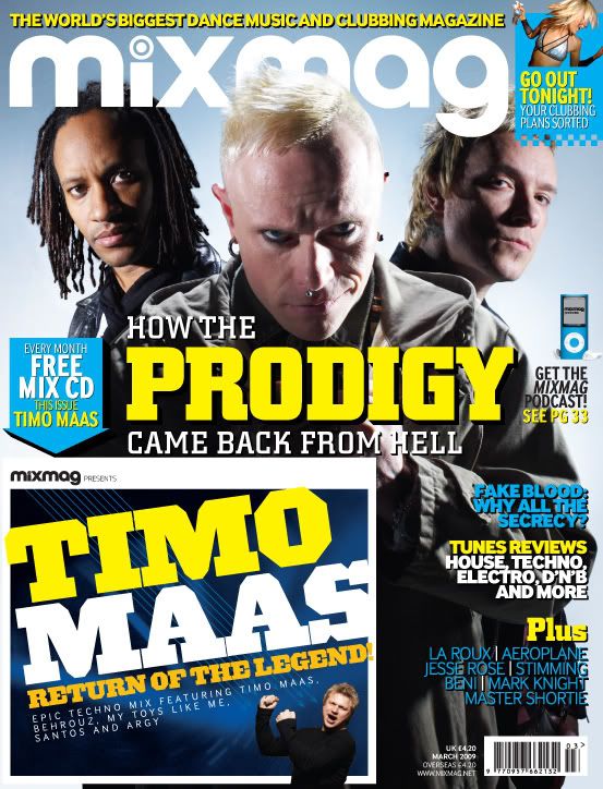
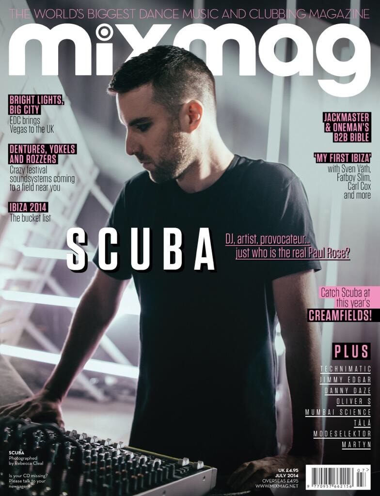
Mixmag colour scheme:The primary colour of mixmag is white which the mast head is here but sometimes changes depending on the weeks colour scheme.this week the secondary colour is a pink.

  1. AUG (Anything underground) - referring to the different amount of underground music genres in  the magazine
  2. OFF Beat
  3. B-Side - the B-side of a record is the back which normally had the more unknown tracks that weren't as heard almost like the music that is represented in this magazine.
  4. BPM-stands for Beats per minute which is majorly important in electronic dance music so much it can determine genre
  5. Wave -all the sounds are in wav form meaning music is linking to music
  6. EQ - Equalization is a big part of dance music
  7. Scratch - in early era of hip hop/electro DJ's used to scratch on vinyl 
  8. Fantazia - was a Rave that went on for many years in the early 90's and went down in history
  9. Gain (G+) - gain is to add to the volume as this type of music is usually played loud
  10. Fades - refers to the crossfader in the middle of a mixer.
  11. On WAX - all old school dance music was first mixed and on vinyl which was made.
  12. Filt - short for filter
OFF Beat is the magazine name i chose for my magazine.off beat  refers to not coinciding with the beat which connotes that this magazine does not coincide with the mainstream (the beat) and focuses on the more underground electronic dance music (the off beat)

Feature story's


all four of these mix mag cover story's feature  the name of the artist as their feature story's.The main image on the front also correlates with the artist/s most of the time being a picture of them for example we see on the fist magazine Steve Aoki is the main feature signified by the large text in the middle and behind that is Steve Aoki.On my final outcome i should hope to use the same formula as Mixmag.


Mise-en-scene location and prop ideas


magazine location ideas;
Techno as a genre has always been seen as industrial and mechanical .Berlin one of the forefronts to the genre ,after the fall of the Berlin wall many of the warehouses and factories became abandoned and were taken over by club owners and youths alike where they would hold raves and buy property for cheap.Like Berlin , Detroit the origin of Techno had the same thing as Berlin after the decline of Detroit, factories closed and houses were abandoned and the music of the time reflected the harsh brashness of life in Detroit. the people joined together to hold raves in old factory's and abandoned buildings.
old industrial buildings with urban dilapidation would be a good location for my photo shoot.


A theme runs throughout these pictures of what i have explained, a theme of old buildings in an urban or industrial environment which will help my location ideas about my photo shoot i have an idea of where the pictures could be taken at the old cattle market as it is abandoned overgrown but still has urban elements or another location could be the old mill in Driffield as that resembles some of the clubs found in Detroit.
low ambient lighting is needed for these photos to look as if they where taken at a rave/club,picture should look almost as it was taken on a film camera like a throwback to the early 90's rave nostalgia which is just an idea.

Another location idea could be a studio or home studio this is the place where producers make there music many people are intrigued by the many controls and lights and do not know much about the process of making a track and feel like it is overwhelming and confusing how producers make music,which is why a shoot in a studio would be good as it shows the readers more insight into the process without having to actually experience  it and make their own mind up.just as well home studios will do the trick as that's where many dance music started of in the rooms of pioneering  artists with a more of a DIY aesthetic which maybe the audience can relate to.

The third location could be in a photography studio for the front cover as it is clear and shows just the Artist etc without distracting the reader away from that.For instance Mix Mag and Dj mag mostly use studio shoots for the front cover and are highly manipulated,Dj's/Producers are quite often seen as out there people or illusive figures behind a moniker and with uses of light and experimental photography techniques can show this.
 

Props- props used in my shoot should link to electronic dance music.stereotypical items are Turntables,Headphones,synthesizers,Midi controllers etc there may be limits to certain things such as turntables could not be taken to a location is not so easy.As i said erlier Dj/Producers often hide behind a moniker and sometimes even masks such as Daft Punk,Mf Doom and so on.They say hiding behind a mask makes it easier for people to recognize their music for being good music not just the fact of who they are and keep that away from the audience.Some kind of mask could be used in the  photo shoot to hid the face/s of the Model.
  

.

Costume designs

this fit of clothes really demonstrates that the readers and djs are of a higher class and thus being able to buy more expensive clothes from designers like Raf simons ,Japanese fashion house Comme des Garcon and others.the all black fit finished with the hip bag imply a stealthy aspect to the fit  to almost blend in with the club/rave/event like a night person which Dj's are.the accessories i have chosen are a supreme hip bag  and a bronze 56k cap this two brands are skateboarding company's but with the rise of skateboarding fashion more people are starting to wear it.
this fit differs from the other as this is more outwear with the layers of t shirt ,hoodie and jacket.i have chosen these clothes as is more casual and something you wouldnt wear to an event ,the camo jacket really steals the show and connotes to the audience a sense of rebel  and stay hidden camo has been used in many youth cultures in Britain and stands the test of time bringing dance music into this tradition.the vans and slim dickes also give a laid back tone which the audience can replicate on the cheap.

this fit is more sophisticated and mature to say and shows the sophistication of producers wearing vintage pieces such as the cord shirt and french work wear jacket that clash with the youthful converse  this is overall the cheapest and most accessible to the audience .

Style/ iconography of my product


here is a collection of fonts i have gathered to see which ones suited the title and theme

Eventually i found a font called inversion which i like and feel as if it could be on a music magazine with its contemporary edge which reflects the music within my magazine.the font is a type of block serif and decorative hybrid.
Album covers i like
All these covers have something in common and that is that they are all odd and abstract, avant-garde to say if you will.
 magazines i find inspirational/like the style of.


A theme through these magazine covers is minimalism and focus on the main image and masthead.the models hands are in most of the pictures touching the face/head is a common theme almost the thinking mans pose or covering part of the face.

Imagery i find interesting are very LoFi,film style pictures because it gives the images muted soft tones reminiscent of the 90's rave scene with the snapshot aesthetic.